
Network Services Usage Integrated Views
In this example case of use, we illustrate through real-life examples how the custom classification of known (groups of) IP addresses – into different activities that partition your Organisation, as well as per location (site, building, room …), complemented with geo-IP location of the Internet peers by country – reveals the way your implemented network services are actually used.
The trafMon advanced capability of extracting detailed observations by interpreting the protocol exchanges also permits to present operators with unique key performance indicators summarizing the behavior of the specifically monitored exchanges.
This example is reproduced in an associated tutorial document that also highlights the relevant portions of the configuration tuning permitting to produce the types of traffic observations and their further aggregation modelling the synthesis reports content.
1. Custom Classification of Communicating Entities
Any Organisation relying on distributed network services is structured into departments, sections, business units, or whatever collection of entities that we designate under the generic name of Activities. In our context, the object of such partitioning is to give a common label to groups of hosts and of LAN segments.
The Organisation also relies on intranet internal communications between different known Locations.
So, any know IP address (private or public) belonging to the Organisation own network can be assigned both an activity name and a location name. The observed network data flows are then of either of five types:
- kept inside a same activity at same location
- kept inside a same activity, but between different locations
- between two different activities, but at same location
- or between two activities, at two different locations
- finally between any own host and a peer on the Internet; hence pinpointing the external communications of each activity and/or each location with peers whose addresses belong to different Countries.
The trafMon probes can act the same as dumb NetFlow devices, by measuring, at every unit of time (e.g. one minute, but could be down to 10 seconds intervals), the volume (IP bytes) exchanged in each direction by every discovered instance of data flow. This forms the basis of the volume and data rate figures presented in the synthesis reports templates.
NetFlow slightly differs, in that it produces a record typically at the end of a data flow activity. So its evolution during its lifetime isn’t actually known. The trafMon tool is however able to integrate NetFlow (v5, v9, as well as cFlow and IPFIX variants) sources by equally distributing the individually reported flow data volumes, equally over the successive minutes of their respective lifetimes. The NetFlow add-on relies on the CERT SiLK open-source tool-set from Carnegie-Mellon University, whose collector receives the flow measurements records, save them in logs which are extracted (typically every hour) as input to the trafMon database loading process.
A batch process, executed typically once a day, aggregates the hourly and weekly data volume tables, ready for per-Activity, per-Location and per-peer country on-demand grouping. When a same data flow is seen by two or more probes (or NetFlow reporting device), the observation with the highest volume value is taken, independently for Ingress and Egress.
These prepared volume observations are complemented by specific TCP and FTP KPI’s (Key Performance Indicators) produced by the trafMon probes, so as to present these meaningful summaries in the operators’ oriented reports.
2. The drill-down reporting Menu Bar


Either the report instantiation can be run in batch, to produce a formatted document, e.g. a PDF, via command-line, or the report is generated on-demand, after the user has selected values for its parameters.
For this second alternative, a dedicated JavaScript web application has been drafted with Angular.js and PHP, to let the user easily select in adaptive menus the report he wants to be presented on the fly.
The shape of the menu bar varies between that for synthesis reports, and the one for reports presenting protocol detailed observations.

3. The Manager Report
The Manager Report template intends to show the observed Ingress/Egress Volumes (per Day or per Hour in a Day) as well as their bit rate evolution and their pie chart distribution of a collection of Top-N speaker Entities, and the global volume distribution with their Peers (Locations or Internet Countries)
Entities are either known Activities, or known Locations, or Hosts of a given Activity at a given Location.
3.1 Most General: Top-N Activities
With a browser, we reach the trafMon reporting entry URL, with or without user authentication and/or HTTPS security depending on your chosen settings, e.g. on the localhost:
127.0.0.1/trafMon
which is automatically remapped to the menu bar for synthesis report:
127.0.0.1 /trafMon/#/volume
The DBMS MySQL server is then queried to retrieve the list of databases whose name starts with tmon with trafMon.
Let’s select the database trafMon, and Probe data (observations collected by the set of trafMon probes instead of NetFlow records) and, of course the Manager Report type:

In order increase the readability of the report as well as its generation speed, we can limit the content by selecting how many speaker Entities to cover (top-5, 10, 15, 20 or 25) and the lower threshold on data rate to preserve in the display (none, 1, 10, 50, 100, 500 Kb/s).
Then, with the calendar app, we select one reference day, and the report time span: Day Week or Month. The resulting displayed time range adapts to cover encompass the selected Day. It is then possible to use the Prev/Next button to switch to the adjascent time span.

Now, we have the choice among 8 different variants for the produced report structure: a combination of 3 independent binary choices:
- Compact or Exploded: whether the same charts set will show both Ingress and Egress figures together, or that an Ingress-only section is followed by an Egress-only part;
- Stacked or not: whether, per time unit, the Ingress or Egress volumes of the respective Entities will be aside each other or piled in the bar chart;
- Single or Multi-Page: single-page is HTML browser oriented, while multi-page involves the frameset utility of the BIRT viewer, which allows to navigate through the several pages as well as to download them as a document. It also permits to download the set of data values (dataset) behind the different report objects, e.g. as a csv file loadable in a spreadsheet.

Finally we can launch the generation of the report by clicking on the View button at right of the menu bar.
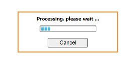
The BIRT dynamic slider window appears during the time data are retrieved from the database, then are further aggregated per selected Entities then the charts are built and laid out
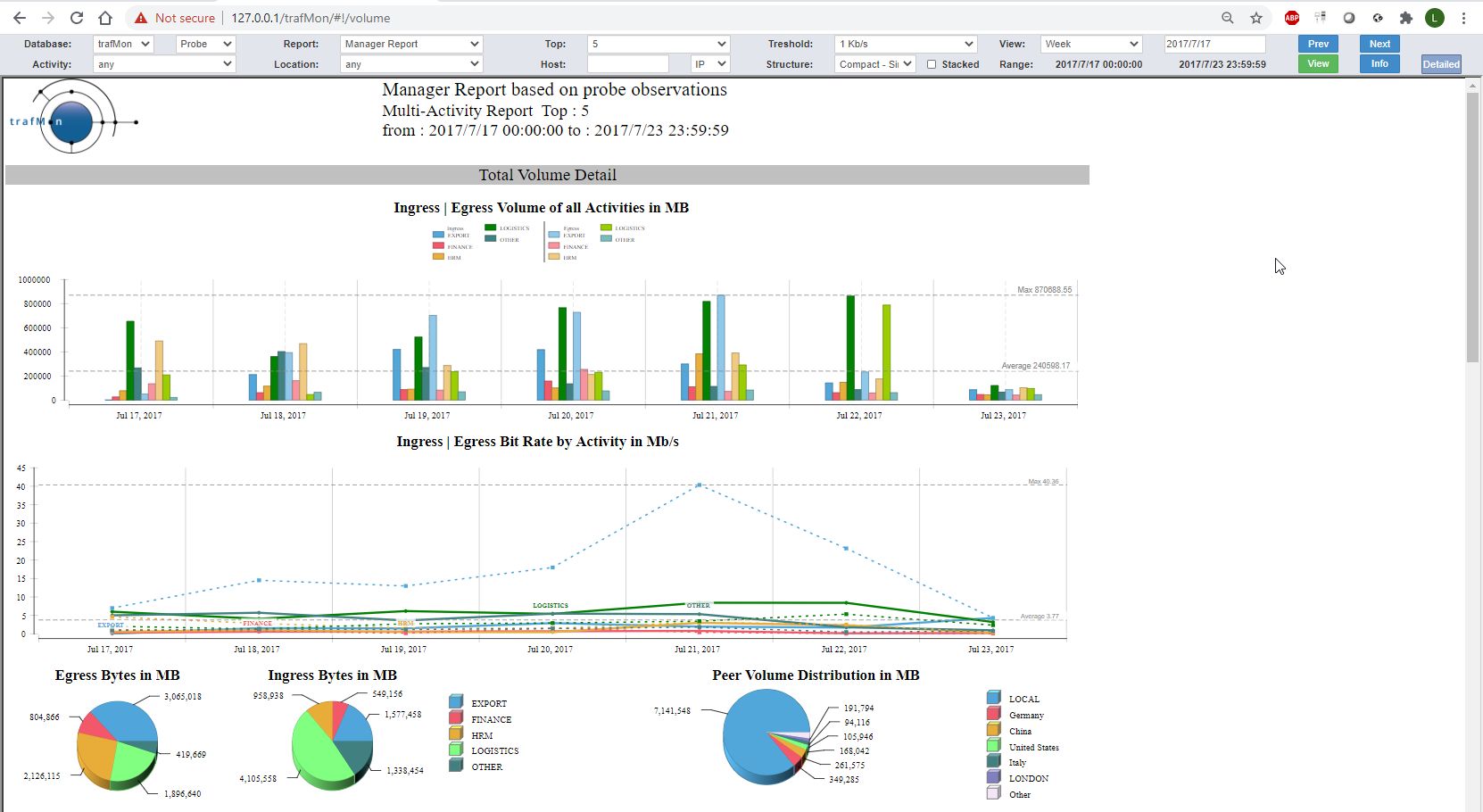
The produced report (compact, single-page, no stacked bars) is covering one week of top-5 Activities (EXPORT, FINANCE, HRM, LOGISTCS, OTHER) and a data rate threshold at 1 Kb/s.
It exhibits three parts with the same layout.
3.1.1 Total Volume Details – upper section
The section at top shows the combined Ingress and Egress view of the total daily traffic for each Activity:
- Ingress means the sum of all traffic volume (and rate) this is incoming to any host belonging to a given Activity, wherever the host is located;
- Egress means the sum of all traffic volume (and rate) this is outgoing from any host belonging to a given Activity, wherever the host is located.
The bar chart shows the volumes (ingress at left and egress at right) of every top-5 Activity, for each day of the week.
The multi-line chart shows the evolution of corresponding data rates (dashed lines are for Egress rates).
The pie charts at left display, in another way, the respective sizes of the bars in the top chart, split for Egress and Ingress directions.
The pie chart at the right shows, for all covered Activities and directions together, the most significant volumes exchanged with peer Locations or with peer Internet Countries.
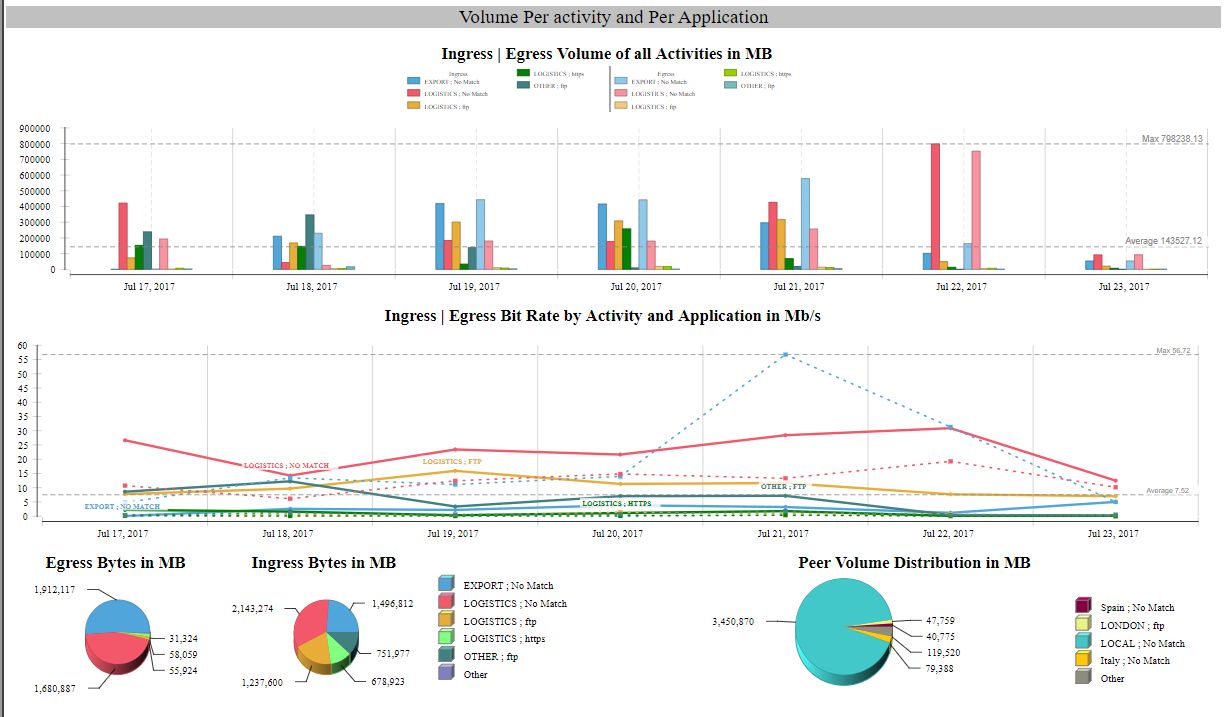
3.1.2 Volume per Activity and per Application protocol – middle section
The intermediate section shows the combined Ingress and Egress view of the total daily traffic for each Activity and each network service protocol (application). It is the section of finest granularity, because the per-Activity Volumes of the first part are further decomposed per service protocol, but again, only the top-5 are displayed.
The layout is the same as above depicted.
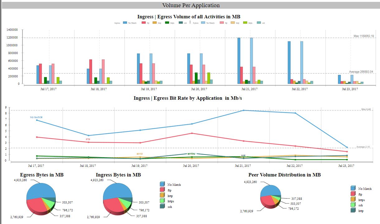
3.1.3 Volume per Application protocol – bottom section
The lowest section shows the combined Ingress and Egress view of the total daily traffic for each network service protocol (application), summed-up for all concerned Applications.
Of course, in this case, the ingress/egress figures are symmetrical: what goes out for a protocol goes in using the same protocol.
The layout is again the same as above depicted.
3.2 Top-N Locations for a given Activity
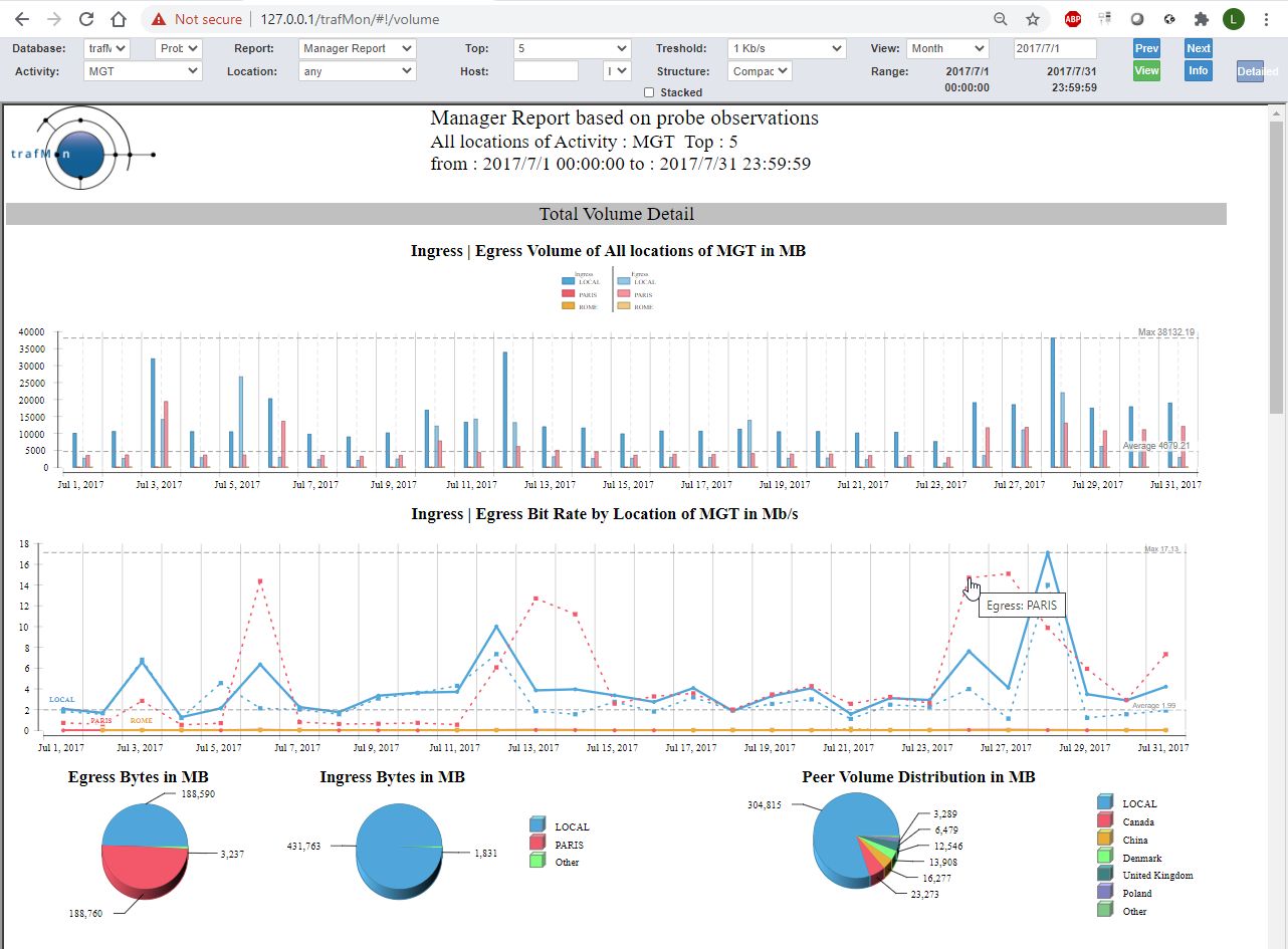
When one selects a given Activity, MGT in the example, the report is produced for every (top) Location that exhibits traffic belonging to this Activity.
In the example below, the report lapses over all days of the specified month. Only the top section of the report is actually shown.
3.3 Top-N Hosts in a given Location
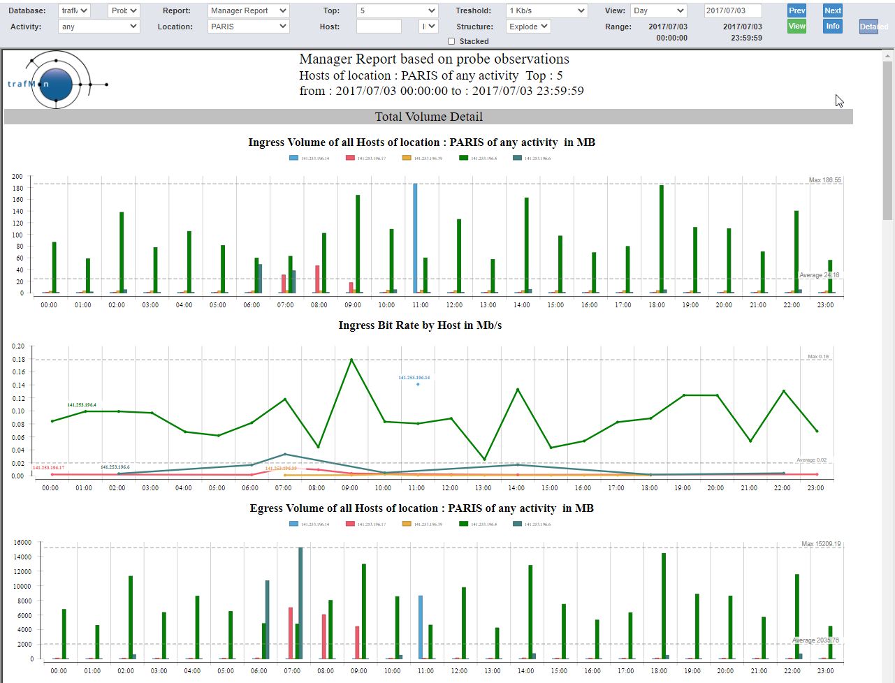
When one selects a given Location, PARIS in the example, the report is produced for every (top) speaking host at that Location. When a particular Activity is also selected, the candidate hosts (for the top speakers selection) are those belonging to that Activity.
In the example below, no Activity is selected (any), and the report lapses over all hours in the selected day.
We have selected the exploded form, where each of the three sections have their two evolution charts doubled: Ingress figures followed by the Egress ones. The image shows only the start of the report content.
3.4 Focus on a given Host
To produce a report about a given host, one has to write its IP address in the Host field of the menu bar. This field is provided automatic assistance. When an Activity, a Location or both are chosen, for a selected period of time, clicking in the Host field shows the only possible first IP byte set of values. Then its menu passes to the second and subsequent two bytes.
Note the IP/DNS choice is not related to the input, but to the way hosts addresses are presented in the reports (address or DNS name).
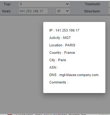
When the Host IP address is filled-in, one can request its related characteristics – as known by trafMon – by clicking on the Info button.
The example below shows the last part of the Manager Report for the given Host over one month.
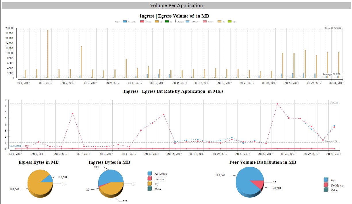
As its name indicates, the manager report doesn’t enter into any technical details. So we closes here this dedicated section to cover the two kinds of reports drawn from the suggestions of a real experienced operators’ manager.
4. The Operator Report
The Operator report follows the same drill-down path as depicted extensively here above for the Manager report:
- Multi-Activity (any), per-Location (any top) view,
- Single-Activity, per-Location (any top) view,
- Single Location, per-Host (any top) view,
- Single Host view
But the first three levels present the chart in a more compact layout, and without the pie charts.
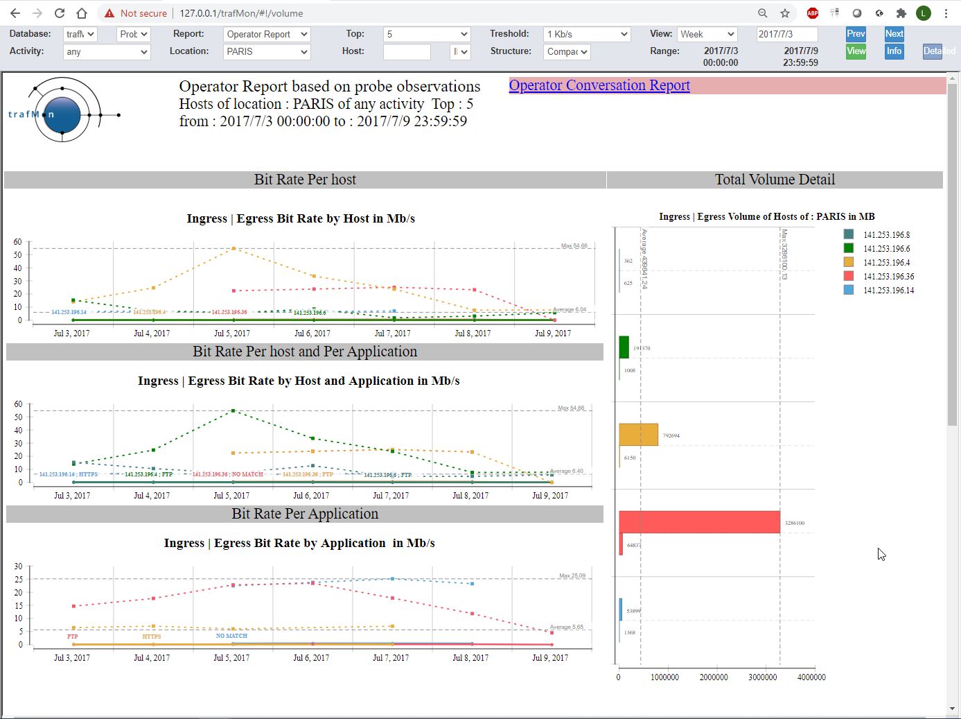
The example below shows the full content of the third drill-down level: top 5 hosts located in PARIS among all Activities.
Compared to the Manager report, the three sections are limited to their bit rate evolution plots, and the bar chart, drawn vertically, shows the Ingress/Egress volumes of the top-N Entities (top-5 hosts in our example).
When both Activity and Location are selected, the Operator report ends with a table presenting the list of member hosts. Each is accompanied with a hyperlink for displaying the host sibling Conversation report (see below) in a separate tab.

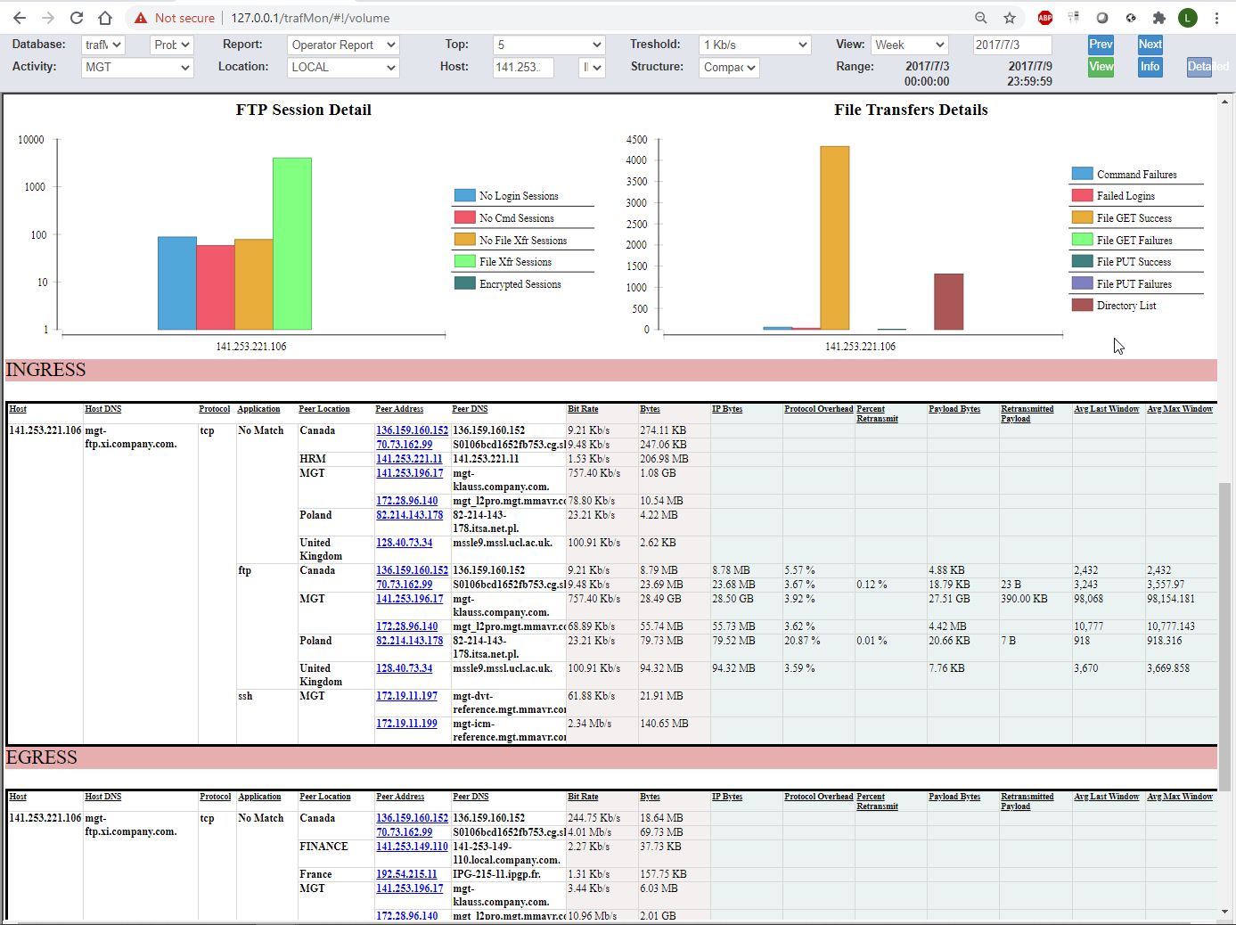
When an IP address is specified in the menu bar Host field, the Operator report ends with charts and tables KPI’s derived from on-the-fly stateful protocol analysis performed by the trafMon probe. This is further explained in section 5 below.
5. The Conversation Report
The above described Operator report has a sibling called Conversation report. This can be specified classically, via the menu bar. And it can be immediately launched, in a separate browser tab, via the top-right hyperlink shown in the Operator report.
While the focus of an Operator report is the top-N Entities that are part of the selected context (Activity and/or Location), the Conversation report focuses on the Peer Activities and/or Internet Countries:
- Multi-Activity (any), view draws the traffic with the top-N peer Activities and/or Internet Countries
- Single-Activity, any or single Location view draws the traffic with the top-N peer Activities and/or Internet Countries
- Multi-Activity (any), single-Location view draws the traffic with the top-N peer Activities and/or Internet Countries
- Single Host view draws the traffic with the top-N peer Activities and/or Internet Countries
As for the Operator report, the Conversation report has a hyperlink in its top right corner that opens the sibling (Operator) report in a new tab.
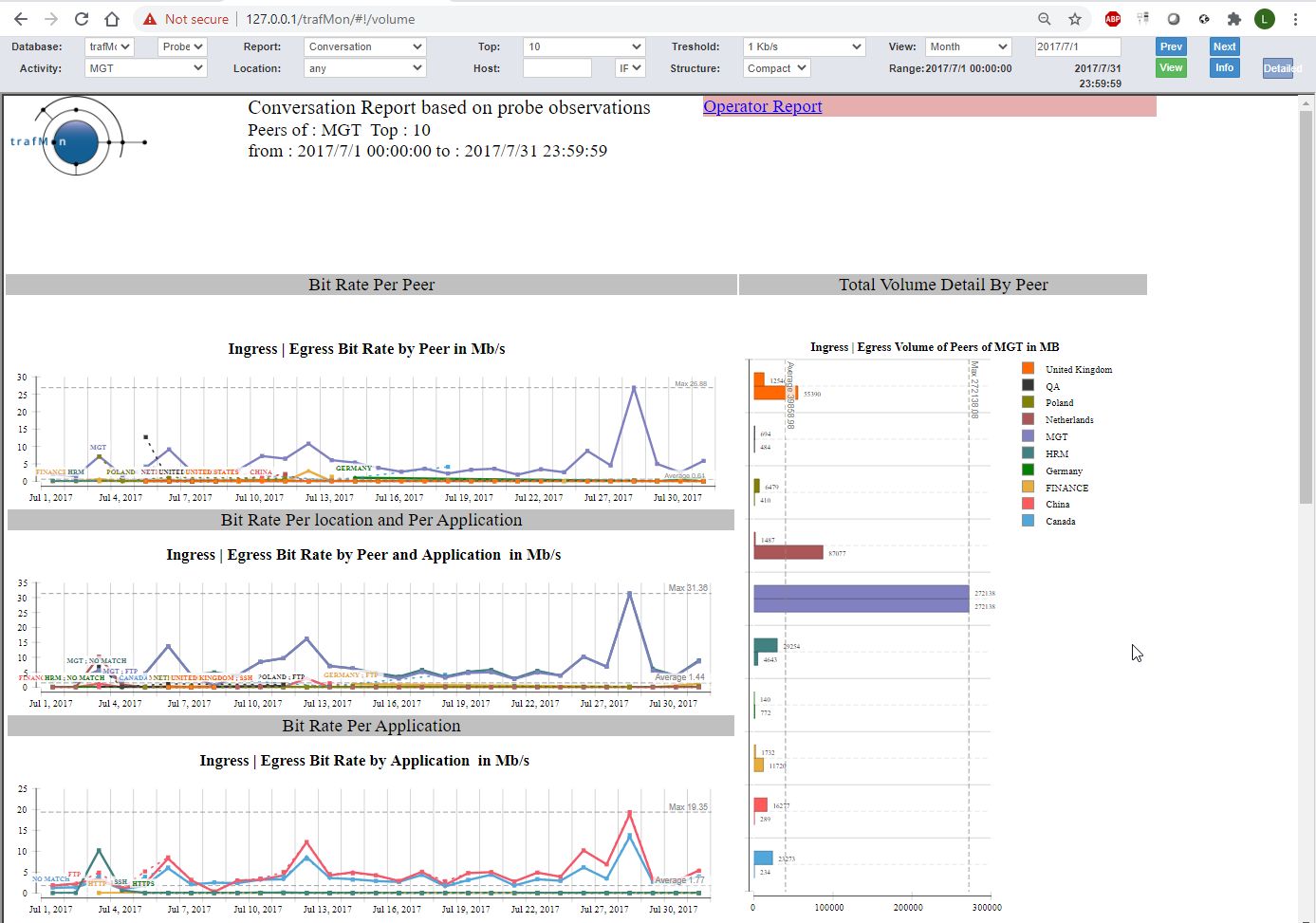
As for the Operator report, when the conversation report is applied to a given Activity and a Location, it ends with a list of member Hosts, directing to their respective Conversation reports with details.
Similarly, when the Conversation report is applied to a specific host address, it ends with the protocols KPI details.
6. Protocols KPI details at Host Level
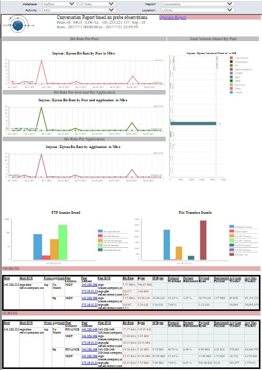
Operator and Conversation reports drilled down to the level of a given IP address end with two charts reflecting statistics about FTP service activity, followed by two tabular presentations (Ingress then Egress) of traffic volumes with respective peers, split by service protocols.
Of course, the FTP charts are filled only when the subject host has actually participated to FTP exchanges (being a client of server).
In the tables, the observed volumes (Bytes and Bit Rate) observed at IP layer are provided for every pear. But, depending on the trafmon custom runtime configuration tuning, TCP observations (including the derived IP Bytes) are only collected for a subset of service protocol (FTP, HTTP/HTTPS in our case).
The picture shows the entire Conversation report with the protocol details in the second part.
6.1 FTP related statistics
The FTP detailed statistics are presented in two parts:
- Those different types of FTP sessions;
- and those related to actual FTP activity (mostly related to data transfers).

For FTP sessions, we distinguish between the following types:
- No Login: this is either due to suspicious port scan or access attempts, or to service availability monitoring: a TCP connection is established with the server (port 21), but the user doesn’t try or doesn’t succeed to login before closing the TCP control connection;
- No Command: client user is correctly logged-in, but doesn’t execute any further FTP command (even not QUIT) before breaking the TCP control connection;
- No File Transfer: this is typically a file system browsing: the user executes at least one FTP command, he could obtain information about files and even get a directory content listing (same mechanism as for actual file transfer), but he doesn’t start an actual file put or get operation;
- File Transfer: the user (attempts to) transfer(s) one or more files during his session;
- Encrypted Session: As soon as the TCP connection is established, a request to start an encryption handshake is made, so that the trafMon probe isn’t able to further analyse the client/server dialog.
For the second FTP statistics chart on FTP protocol activity, mostly dedicated to data transfers, the report provides:
-
-
- Command Failures: the number of FTP commands responded to with an error code by the server;
- Failed Logins: the number of refused username/password login attempts (maybe the user finally succeeds thereafter);
- Successful File Get: number of files correctly downloaded by the clients;
- Failed File Get: number of files download requests that do not result in a correct and complete file transfer (failed to start or failure during the transfer);
- Successful File Put: number of files correctly uploaded by the clients;
- Failed File Get: number of files upload requests that do not result in a correct and complete file transfer (failed to start or failure during the transfer);
- Directory Listing: in FTP, the listing of a file system directory content involved the same complex mechanism as for downloading an actual file, hence it may be interesting to see the number of successful directory content transfer; it also shows the level of file system polling (content discovery or waiting for the presence of an expected data file).
-
6.2 Volume with Peers and TCP Quality Indicators
Being for Ingress or Egress traffic, the protocol KPI tables present the set of flows ending in the target host, split by peer host and by network service protocol (so that a peer IP address can appear more than once, when involved with different protocols).
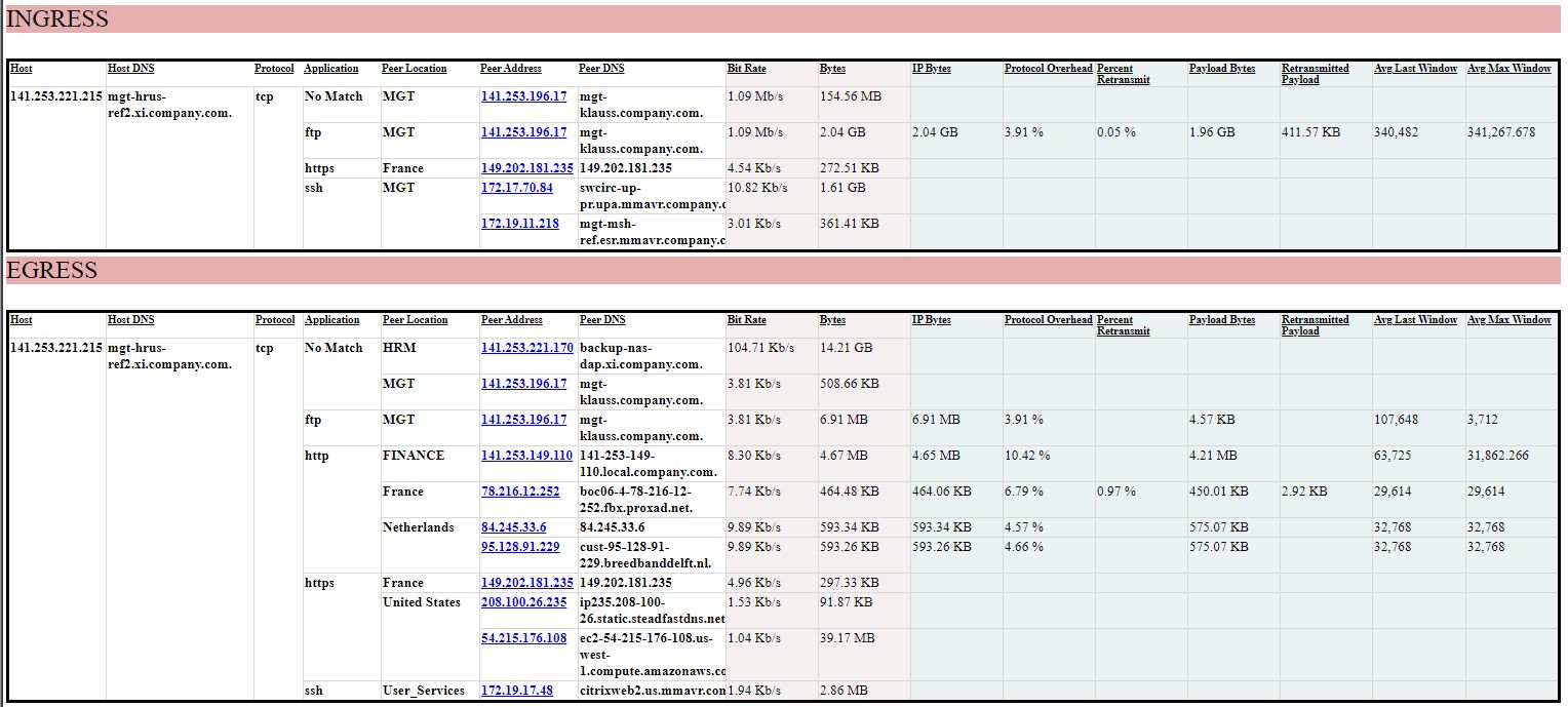
Bit Rate and Bytes are derived from direct measurement of IP packets. They are available for any TCP or UDP data exchanges.
Remaining indicators are obtained only for specific network service protocols for which the TCP observations are obtained for the trafMon probe(s):
- IP Bytes value is re-constituted from the TCP volume added with a nominal IPv4 header size per TCP data chunk. So it may slightly differ from IP level observations.
- Protocol Overhead is computed from the ratio of actual first transmission of TCP payload data segments and the IP Bytes total volume. It increases with the number of TCP retransmissions, but is also inversely proportional to the size of IP packets (the more packets are needed for a given payload, the higher is the proportion of IP and TCP headers relative to the transferred payload size)
- Payload Bytes counts the volume of TCP segments payload, being first transmission or re-transmission(s).
- Retransmitted Payload counts the sum of bytes of TCP payload that has be retransmitted a second or subsequent time.
- Percent Retransmit is the ratio of the here above two values.
- Average Last Window is the average over all observed TCP connections of the window size at end of the TCP connection and relative to the Ingress or Egress direction. Well conducted connections end with the same window size as the maximum reached during its lifetime.
- Average Maximum Window is the average over all observed TCP connections of the maximum window size reached during the TCP connection lifetime.
This page can also be downloaded as doument: Use Case 1: Network Services Usage Integrated Views
